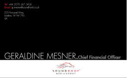
Another Business Card designed with the same logo. The type face in use is still FUTURA. The name of the person is enlarged and represented by FUTURA LIGHT which makes it look elegant while the job title is minimized and embodied by FUTURA HEAVY which makes it feel a bit "heavy", "important" etc.
Meanwhile, the Telephone and Address paragraphs are placed on the top left of the card in order to balance it. Deliberately left in the middle and the top right of the card is the "white" space. However, such "negative" space somehow generates a sense of comfort and generosity to the card itself.

0 Comments:
Post a Comment
<< Home