Friday, December 29, 2006
Friday, December 22, 2006

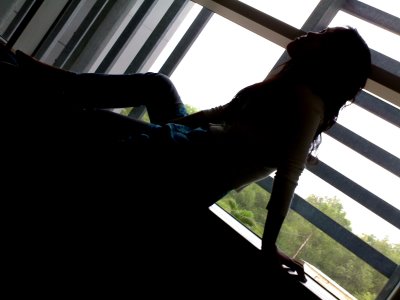
Model: Nguyen Huynh
Photographer: T. C. Nguyen
I took this photo in the Bowen Room with all the lights turned off. The background was created by a Windows Media Player Visualization and showed up on the wall through a projector.
The model's body features was darken and made blurry to emphasize her outer curves and shape.
Unlike any photo, it's hard to tell which one is the distinguish component in this photo, the model or the background. Maybe they just cooporate, supplement each other to create a sense of harmonious .
Friday, December 15, 2006

I was inspired by the BOSINI fashion advertising panel to create this. The font in use is Alba. All the colors of the texts are sharing the same values of RGB, HUE and BRIGHTNESS. They are only various in the SATURATION values.
Plus, the texts are set size differently and placed randomly to create a sense of mess but relaxing and freely but also hot and tough .
Tuesday, December 05, 2006
Sunday, December 03, 2006

Another Business Card designed with the same logo. The type face in use is still FUTURA. The name of the person is enlarged and represented by FUTURA LIGHT which makes it look elegant while the job title is minimized and embodied by FUTURA HEAVY which makes it feel a bit "heavy", "important" etc.
Meanwhile, the Telephone and Address paragraphs are placed on the top left of the card in order to balance it. Deliberately left in the middle and the top right of the card is the "white" space. However, such "negative" space somehow generates a sense of comfort and generosity to the card itself.


